Things to do to Avoid DIY Disasters!
By Jen Taylor on Jul 17, 2015
There is a plethora of interior design and decor blogs on the Internet offering design tips and DIY projects to help you keep your home stylish and inviting. However, what happens when these design choices go awry? How do you weed through the good advice and the downright disastrous? Let’s take a look at some of the poor paint colour choices, particularly unsettling patterns, and DIY disasters floating around the Internet and learn what works and what should be left well enough alone.
Colours: Keep it simple
There are many instances where a bold or dark colour on an accent wall can invigorate the room and draw the eye to architecturally interesting aspects of the space. However, more often than not, painting an entire room a vivid and impactful colour can become overwhelming and distracting. For instance, this pink room breaks several key design rules. Firstly, the room has a fairly small window and is not well lit - an important component to consider when choosing your paint colours. Also, the intensity of the pink and the loud pattern gives the eye no place to rest. This makes the bedroom distracting rather than calming, and gives the impression that you’re waking up in Barbie’s circus tent.
 Don't do this!
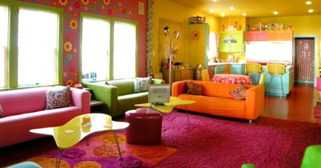
Incorporating too many colours into a single room can also be visually chaotic. In order for the room to be calming, the colour palette must be cohesive and complementary. Decorating in exclusively bright colours (feature image) gives the room a frenetic feel, and the lack of balance leaves the eye nowhere to rest. Balance is easily achieved by choosing two primary colours and accenting with a handful of secondary colours. This will also make the room feel more mature. Don’t let these examples scare you away from choosing interesting colour palettes and bright colours. Just be sure it is carefully thought out and used in moderation.
Pick your patterns carefully
It can be very difficult to pull off tie-dye without looking like you just returned from a Grateful Dead concert in 1967. Tie-dye has become synonymous with several subcultures and often breaks many of the bold colour rules we just reviewed above. Though it can be tastefully added to a room in moderation, it’s rarely a good idea to use this as the focus of your room.
 Via Pinterest
Another pattern with negative connotations is zebra print (or any animal print). Though there are some instances where zebra print works, it is often associated with a “tacky” or “cheap” sense of style. The print becomes even more awkward when it appears in unlikely places or as an unusual accent piece, like on this stand-alone bathtub or this ceiling fan. Unless you’d like to emulate Elvis Presley’s infamous Jungle Room vibe, it’s usually best to leave the animal prints alone.
 via apartmenttherapy.com
Bad DIY choices
The design blogs have recently been buzzing with tutorials and advice for painting and wallpapering staircases. For many, the staircase is a central feature in the home and an opportunity to make a creative or bold statement. However, for every beautifully painted staircase, it seems there are ten outrageous ones.
In theory, orange seems like a great colour to paint your staircase, but consider how the paint will wear after extended use, and how it interacts with the other colours in your room and on your walls. If you decide to forgo the painting, absolutely do not bejewel your stairs, (or anything in your home for that matter). When looking for ways to give a staircase a facelift, it’s best to keep the colour palette and patterns simple and clean.
 Via Pinterest
Another recent design trend is the painted or wallpapered fridge. Like the stairs, painting the fridge can be a unique way to update a tired kitchen or hide an ugly appliance. Chalkboard fridges are especially popular, and an understated way of adding some creativity to the space. Fridge makeovers should never be too loud, or draw attention to the “clunky” nature of the fridge. It should also match the look of your kitchen and create balance not confusion. Fridges are expensive appliances, and it’s probably a good idea to strive for an understated look to avoid getting stuck with a DIY disaster.
 Via Pinterest
If these examples didn’t whet your appetite for horrible design choices, you can always check out Regretsy, a site and book dedicated to documenting the unusual decor “craftcidents” that appear on Etsy. Or, find out what designers consider to be the “worst trends” for the home and how to avoid decor faux-pas over at Apartment Therapy. All joking aside, at the end of the day, style is subjective and you should strive to live in a home that makes you happy, regardless of what designers and bloggers have to say about your personal style choices.
If you just purchased a new home, check out out design and décor tips from Jo-Ann Capelaci!